In times of an ongoing global pandemic and constant video meetings, more and more people are leveraging their bookshelves at home to not only create appropriately stylish screen backdrops but also communicate credibility. There’s even a Twitter account on the subject. That being said, not everyone has a library-worthy collection to display or the space to store heavy art volumes. But whatever your personal shelf dream – even if it involves cats – here are five design elements that will help you make the most out of a tool you didn’t know you had, plus real examples of how they are being used to enhance bookshelves in projects around the globe. Head to the bookshelf section on Architonic for further inspiration and concrete product examples.
Library Ladders
Library ladders first gained real momentum in mid-1800s Victorian England. Unlike the designs we see today, these stool-like objects were usually made of solid, intricately carved wood with only a few steps and reserved for members of the aristocracy. Fast forward to present times, and there is a plethora of models to choose from. Depending on the size and accessibility of the bookshelf in question, options include a rolling ladder with guiding rails, a more static model that doubles as an accent piece, or a shorter, wooden step design that echoes the library ladder's 19th-century origins. As the below examples show, all of them elevate pre-existing bookshelf designs to new heights and add an eye-catching element to any room.
Loft no Itaim / FGMF Arquitetos


Plants
In addition to significantly improving a room's air quality, well-placed plants can also serve as beautiful home library framing tools. Opt for long, leafy tresses that tickle your favorite book spines – as seen below in a Clare Cousins apartment project in Melbourne, Australia – or choose flowery pops of color that echo and enhance certain cover shades. One thing to keep in mind is picking the right pot: a more decorative model around a planter that accounts for the specific inhabitant's needs is ideal, as it keeps the botanical accent pieces healthy without deducting from their overall design effect. More information on how to properly integrate vegetation indoors can be found here.
Apartamento POSSAMAI / Sbardelotto Arquitectura + Atelier Aberto Arquitectura

Flinders Lane Apartment / Clare Cousins

Accessories
Just like plants, well-placed accessories can add texture and depth to an otherwise homogeneous book display. Creative freedom is paramount here. Displaying travel mementos, art pieces or decor items with personal history, for example, is a great way to showcase individual interests and make sure newer house guests have conversation starters handy. Catch-all trays are wonderful tools to make use of surplus space and upgrade ‘clutter’, while tall vases can easily fill up empty higher ground. Other possibilities include mirrors to give smaller rooms the illusion of grandeur or clocks to ensure no deadlines are missed in the comfort of one’s own home office.
Loft Space in Camden / Craft Design

Ninetynine Office / Ninetynine

House for Booklovers and Cats / Barker Associates Architecture Office

Furniture Lights
Why do books always look so much better in stores? One answer: because they have the right lighting. Often underappreciated in most non-commercial settings, furniture lights have the power to elevate their subjects and sculpt spaces depending on positioning and brightness. The effect of built-in strip lights is most akin to the continuous glow of store bookshelves – if the aim is to highlight specific volumes, however, targeted spotlights will do the trick. Energy efficiency, too, is a constant factor and is most commonly solved with the use of LED technology. Whichever option one chooses, good lighting design requires patience and some background reading. A start on that can be made here.
Chameleon Villa / Word of Mouth Architecture

.jpg?1648050384)
Living Smell / Waterfrom Design

A Fresh Angle
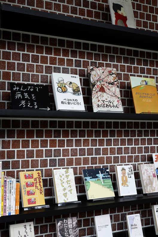
Another bookshelf trick employed by commercial spaces around the world is the right angle. Everyone knows not to judge a book by its cover, but what if that was exactly the point? Display stands or floating shelves put a spin on more traditional book presentation and enable viewers to instantly marvel at elaborate frontal designs rather than having to make do with just the spine. But even if one doesn’t invest in a whole new piece of furniture, playing around with different angles and book placements can cause some unexpected design magic. Especially when combined with the right lighting, clever arrangements will turn even the most unassuming bookshelf into a museum-worthy collection.
Chunfengxixi Reading Club / FON STUDIO

.jpg?1648063174)
Sayanomoto Clinic / Yamazaki Kentaro Design Workshop


.jpg?1648050384)


.jpg?1648063174)